


How to Remove Pet Odors From Rugs Safely
Learn how to remove pet odors from rugs without harming color or fibers, plus when professional washing is the smarter choice for a fresh home that lasts.
A room usually starts to feel off long before anyone can explain why. The sofa is beautiful, the rug is well made, the lamps are stylish, and yet the space still feels unsettled. That is exactly where a thoughtful home decor coordination guide becomes useful – not as a set of rigid rules, but as a way to make every piece in the room feel chosen for the same story.
The best coordinated interiors do not look overly matched. They feel calm, intentional, and deeply personal. In most homes, that comes from balancing foundation pieces with smaller accents, and knowing when to let one element lead while the others support it. A coordinated room should feel collected, not copied.
Coordination is often confused with sameness. That is usually where a room starts losing character. If every wood tone matches exactly, every fabric repeats the same color, and every accessory follows the same shape, the result can feel flat. On the other hand, if every piece is competing for attention, the room feels fragmented.
A good guide helps you create connection without forcing uniformity. It helps you decide which element should anchor the room, how to repeat color in a natural way, and where texture can add depth. It also helps you avoid a common mistake – buying décor one piece at a time without checking how each item relates to the whole space.
In most rooms, the easiest place to begin is with the largest visual surface after the furniture. Often, that is the rug.
Every room needs one element that quietly sets the tone. Sometimes that is a patterned area rug. Sometimes it is a sofa with a strong silhouette, a statement light fixture, or a piece of art. Once that anchor is chosen, coordination becomes much easier because the rest of the room has something to respond to.
Rugs are especially effective anchors because they influence color, scale, and mood all at once. A soft neutral rug can make a room feel airy and understated. A richly patterned rug can bring movement and history into a space that otherwise feels too new. A textured natural fiber look can create warmth, but it may need softer layers elsewhere to keep the room from feeling too stark.
This is where homeowners often face an it-depends decision. If your furniture is already bold, the rug may need to be more restrained. If the room feels visually quiet, the rug can do more of the design work. Neither choice is more correct. The best one depends on how much energy you want the room to hold.
Once the anchor is in place, pull a color palette from it rather than inventing one separately. That does not mean copying every shade exactly. It means selecting two or three key tones and allowing them to show up in different ways across the room.
For example, if a rug includes warm ivory, soft blue, and muted clay, those tones can echo through pillows, throws, ceramics, and even lamp bases. One color can lead, another can support, and a third can be used sparingly for contrast. This keeps the room cohesive without making it feel too coordinated in the old-fashioned sense.
The rooms that feel effortlessly styled usually repeat certain visual cues. A curved shape may appear in a mirror, a lamp, and a vase. A warm brass finish may show up in lighting and small accessories. A woven texture may connect the rug, pouf, and basket. Repetition creates rhythm, and rhythm makes a room feel settled.
Matching, by contrast, can make a room feel predictable. A pillow that is the exact same pattern as the rug is rarely as interesting as one that shares a similar color or texture. The goal is conversation between pieces, not duplication.
This is especially helpful when mixing décor across categories. A room can include wood, metal, linen, velvet, ceramic, and wool quite beautifully if there is some logic behind the mix. Usually, that logic comes from repeated tone, shape, or finish.
When a room relies only on color for coordination, it can feel one-dimensional. Texture is what gives a space depth and comfort. It is also one of the easiest ways to create that quiet luxury look many homeowners want – polished, comfortable, and never overdone.
A textured rug under a tailored sofa. Linen pillows against a smooth leather chair. A knit throw on a bench with a ceramic lamp nearby. These combinations make a room feel layered and lived in. Even a neutral palette can feel rich when the materials vary.
There is a practical side to this too. Some textures are better suited to certain rooms and lifestyles than others. Homes with pets, children, or heavy daily traffic often need materials that are forgiving and durable. A delicate finish may look beautiful in a formal sitting room, but it may not make sense in a family room used every evening. Good coordination always includes function.
One of the most overlooked parts of décor coordination is proportion. A room can have all the right colors and still feel wrong if the scale is off. Small rugs make seating areas feel disconnected. Tiny lamps disappear next to substantial furniture. Oversized accessories can crowd surfaces that need breathing room.
The solution is not simply to buy larger pieces. It is to look at the room as a whole and vary scale intentionally. If your sofa has strong presence, balance it with a rug that properly grounds it and side tables that do not look undersized beside it. If your room has several low pieces, a taller lamp or mirror can help lift the eye.
Pillows and throws matter here too. A mix of sizes often looks more finished than a row of identical pillows. A pouf can soften a room and add function, but only if its size relates well to the seating around it.
Accessories should finish a room, not clutter it. That sounds simple, but it is where many spaces go from styled to crowded. The most effective accessory choices usually do one of three things: repeat a tone from the palette, introduce texture, or add sculptural shape.
That means you do not need many accessories to make an impact. A few well-placed pillows, a throw blanket with the right weight, and lighting that supports the mood can do more than shelves full of unrelated objects. If the room already has a patterned rug or statement furniture, restraint often makes the design feel more elevated.
If the room feels too plain, accessories can add movement and softness. If the room already feels busy, they should simplify and refine. That trade-off matters. More décor is not always better décor.
Lighting is often chosen late, but it shapes the room from the moment someone enters. The right lamp or fixture can connect finishes, soften a corner, and bring warmth to the palette. The wrong one can interrupt the entire flow.
When coordinating lighting with décor, consider both style and glow. A sculptural lamp can add personality, but it should still relate to the room’s materials and scale. Warm light tends to flatter layered interiors better than cooler light, especially in living rooms and bedrooms where comfort matters most.
Lighting is also one of the easiest ways to bridge styles. If your rug leans traditional and your furniture feels more current, a thoughtfully chosen lamp can help the two feel intentionally paired rather than mismatched.
Photos can help with inspiration, but coordination is easier when you can compare texture, tone, and scale in person. What reads as cream online may turn yellow next to your sofa. A blue pillow that seemed perfect on a screen may feel too sharp beside a warm patterned rug. This is one reason a showroom experience still matters, especially for homeowners furnishing more than one piece at a time.
Being able to place options side by side often reveals what the room actually needs. Sometimes the answer is contrast. Sometimes it is softness. Sometimes it is a rug with more presence, or pillows with less pattern than you first expected. At Home Rug Gallery, that kind of hands-on comparison helps turn uncertainty into a room that feels complete.
A beautifully coordinated room is also one you can maintain. That is especially true with rugs, which carry both visual weight and daily wear. Choosing a rug that suits your lifestyle is part of coordination, but so is understanding how to care for it over time.
A family room rug, for example, needs to stand up to regular use while still supporting the look of the space. A vintage or heirloom-style piece may bring exceptional character, but it also deserves proper cleaning and restoration when needed. Design decisions last longer when care is part of the plan.
The most memorable rooms rarely come from buying everything at once. They come from choosing well, layering thoughtfully, and giving each piece a reason to belong. When your home feels coordinated, it does more than look polished – it starts to feel like you have finally given the room its own voice.
Learn how to remove pet odors from rugs without harming color or fibers, plus when professional washing is the smarter choice for a fresh home that lasts.
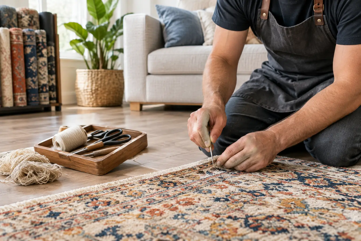
Use this Kennesaw rug repair guide to spot damage early, choose the right restoration, and protect the color, texture, and comfort of your favorite rug.
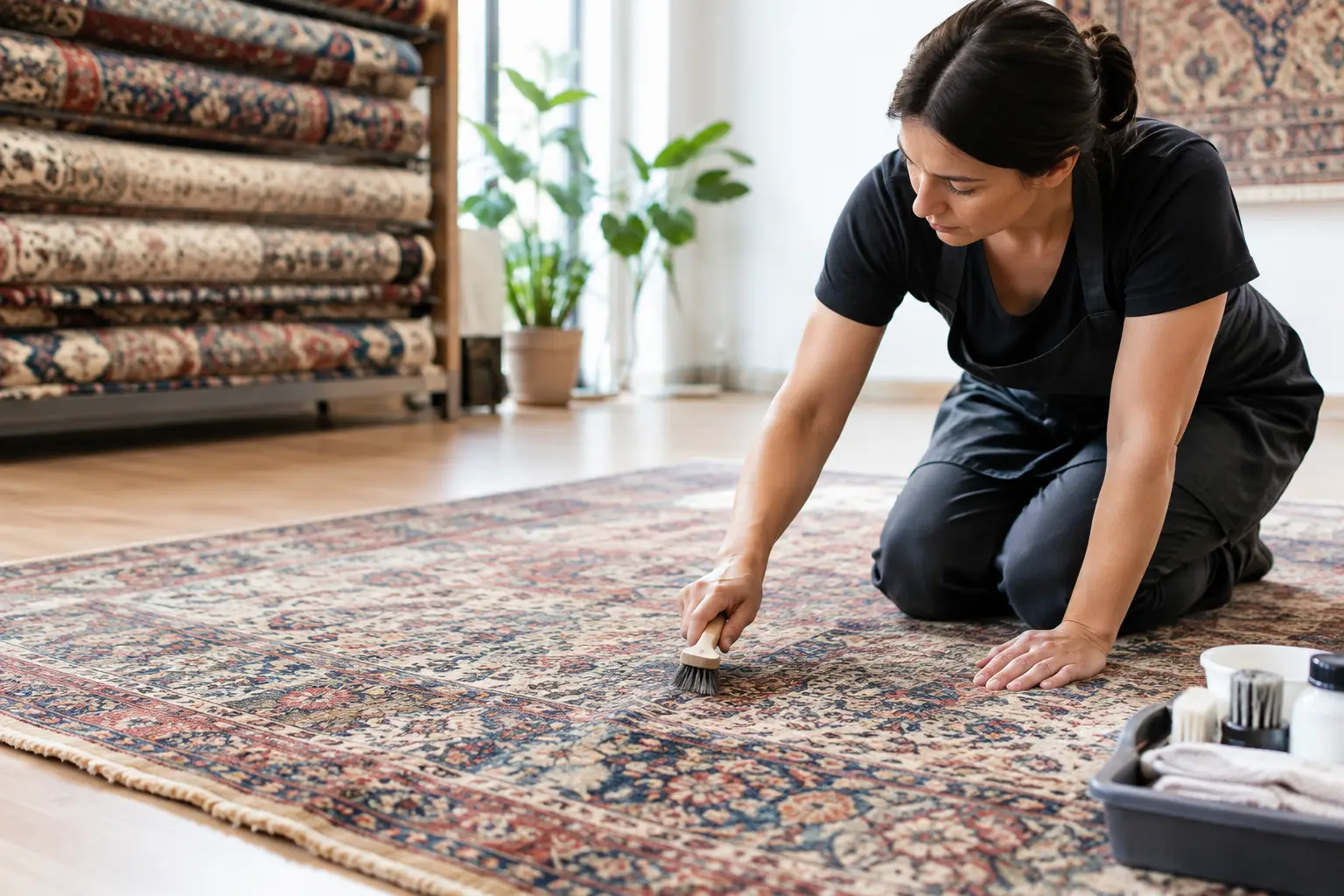
Marietta rug restoration can preserve color, texture, and history. Learn when repair makes sense and how thoughtful care protects a cherished rug at home.
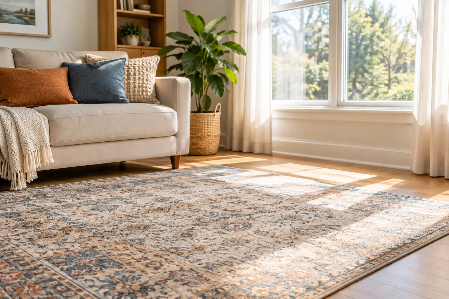
Learn how to protect rugs from sun fading with thoughtful window treatments, rotation, cleaning, and placement tips that preserve color and comfort daily.
From cozy area rugs to statement-making wall décor, our curated categories make it easy to explore what speaks to your space. Whether you’re refreshing a single corner or reimagining your whole home, start here and discover pieces that bring it all together.