

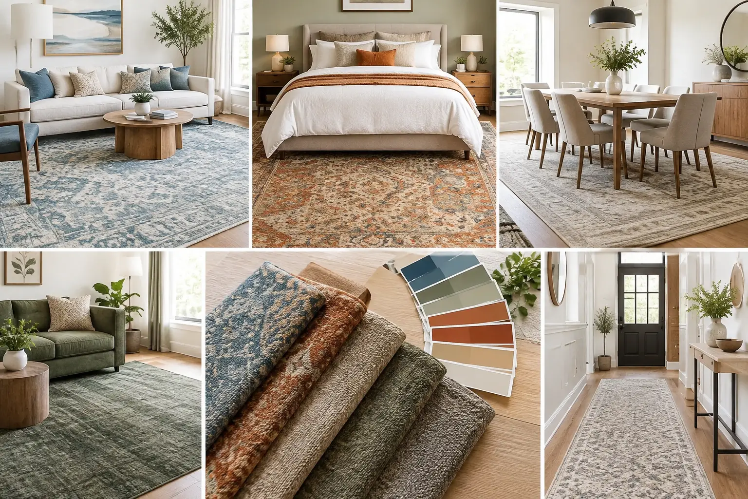
A Guide to Rug Color Matching for Every Room
This guide to rug color matching helps you choose tones, patterns, and textures that make every room feel balanced, personal, and effortlessly styled.
A rug can make a room feel thoughtfully collected, or make an otherwise beautiful space feel slightly off. That is why a guide to rug color matching begins with more than asking whether you prefer blue, beige, or gray. The right rug connects the colors already in the room, softens hard surfaces, and gives your furniture a place to belong.
The goal is not to match everything perfectly. Rooms with too much matching can feel flat and predictable. Instead, aim for a considered relationship between the rug, furnishings, walls, and accents. A well-chosen rug can repeat a single pillow color, warm up cool paint, or introduce a pattern that makes a neutral room feel deeply personal.
Before choosing a rug, look at the finishes that are staying: flooring, cabinetry, stonework, built-in shelving, large upholstery pieces, and wall color. These are the visual anchors of the room, and they should guide the palette.
Hardwood floors, for example, may read golden, honey-toned, red-toned, or cool brown depending on the species and finish. A rug does not need to match the wood exactly. In fact, choosing a rug in the same value can cause the two surfaces to blend together. A lighter rug over dark floors, or a deeper rug over pale oak, usually creates more definition.
Pay attention to undertones rather than just obvious color. A cream sofa may lean warm and buttery, or it may have a cooler gray cast. A gray wall may carry blue, green, or taupe underneath. When undertones work together, a room feels calm even when the palette includes contrast. When they compete, the space can feel unsettled without an obvious reason why.
Most rooms benefit from one color decision that leads the rest. It may be the sofa, a favorite piece of art, patterned drapery, or even a pair of accent chairs. Once you know your starting point, use the rug to support that element instead of asking it to solve every design decision at once.
If your sofa is a strong color, such as navy, olive, rust, or charcoal, a rug with a quieter ground color can bring balance. Look for a pattern that includes a small amount of the sofa color, along with softer neighboring tones. That repeat creates cohesion without making the room feel overly coordinated.
For a neutral sofa, the rug has more freedom to set the mood. A blue and ivory rug can bring an airy, classic feel to a living room. A faded terracotta design adds warmth and character. A rug with taupe, sand, and soft gray offers quiet luxury while leaving room for layered pillows, art, and lighting.
A helpful guideline is to select a rug that relates to at least two other elements in the room. It might echo the wall color and a throw blanket, or the wood tone and a pair of pillows. It does not need to contain every color present. Too many exact repeats can make the result feel busy.
Color gets most of the attention, but value often has the bigger visual effect. Value refers to how light or dark a color appears. A room with dark flooring, dark furniture, and a dark rug can feel intimate and grounded, but it may also feel heavy if natural light is limited. A pale rug can lift that same room and help its furnishings stand out.
In a light, open room, a deeper rug can provide welcome structure. Charcoal, deep blue, espresso, or richly patterned designs create a focal point beneath pale upholstery. If you prefer a softer look, choose a medium-value rug rather than one that is nearly identical to the floor and sofa.
This is especially useful in family rooms. A very light rug can look elegant, but a medium-toned design with movement in the pattern is often more forgiving around children, pets, and everyday life. The practical choice can still feel polished when its colors support the room.
Natural and artificial light can change a rug dramatically. A gray that looks warm in a showroom may appear cooler beside north-facing windows. A cream rug can look nearly white in bright afternoon sun and more golden under warm lamps at night.
Whenever possible, view rug samples or candidates near your existing flooring, paint, and upholstery. Bring paint swatches, pillow covers, or a photo of the room taken in daylight. Seeing texture and color in person is often the difference between a confident choice and a near miss.
Patterned rugs are exceptionally useful when a room already has several finishes to coordinate. They can blend warm wood, cool upholstery, black metal, and softer textiles in a way a solid rug may not. The key is choosing a pattern with enough breathing room.
For a room with solid upholstery and simple drapery, a traditional, geometric, or softly abstract pattern can add dimension. If the sofa, wallpaper, or curtains already have a pronounced pattern, a quieter rug may be the better partner. Consider a subtle tonal design, a heathered weave, or a low-contrast border rather than another bold motif.
Scale matters as much as color. Large rooms can handle generous pattern repeats and stronger contrast. In a smaller den, bedroom, or entry, a large-scale pattern may actually feel cleaner than a tiny, busy print. Small repeated motifs can create visual noise when viewed across the room.
Do not feel limited to one design era, either. A vintage-inspired rug can soften contemporary furniture. A clean-lined geometric rug can give a traditional room a fresh point of view. The unifying factor is usually the palette, not whether every piece belongs to the same style category.
The most inviting rooms generally use a family of related shades rather than a single color repeated everywhere. If your rug includes muted blue, for instance, you might pair it with a deeper navy pillow, a smoky blue vase, and artwork with a touch of slate. This variation adds depth while keeping the room connected.
Warm neutrals work beautifully with one another when they share a similar character. Ivory, camel, mushroom, putty, and warm gray can create a relaxed foundation for wood, brass, woven textures, and natural stone. Cooler palettes can layer soft gray, blue-gray, charcoal, and crisp white for a more tailored feel.
Contrast is still valuable. A room full of warm beige may need black accents or deep green foliage to avoid becoming too quiet. A gray and white room may benefit from cognac leather, aged brass, or muted rust. Let the rug be the piece that either introduces that contrast or gently ties it back to the rest of the room.
Living rooms often benefit from rugs with enough color variation to handle everyday use gracefully. Dining rooms need a design that looks intentional under the table and chairs, where crumbs and shadows are part of real life. Bedrooms can support lighter, softer palettes because the atmosphere matters more than camouflage.
Entryways are another case where function should shape color choice. A pale solid rug may be beautiful, but a richer palette or a patterned construction will generally feel easier to live with near the door. In a high-traffic hallway, look for a rug whose background and pattern do not make every bit of daily wear immediately visible.
A rug should also suit the emotional purpose of the room. Deep indigo, forest green, and warm terracotta can make a sitting room feel grounded and welcoming. Pale blue, sage, and sand lend themselves to restful bedrooms. For a dining room meant for gathering, layered earth tones often feel warm without becoming formal.
Photos are useful for inspiration, but they cannot fully reveal pile texture, true undertone, or how a rug responds to your home’s lighting. Stand back and view the rug alongside the largest items in the room. Then look closer. Notice whether the colors flatter your flooring and upholstery, whether the pattern feels balanced, and whether the texture suits the atmosphere you want.
At Home Rug Gallery, homeowners from Canton and nearby North Georgia communities can compare rugs with the colors and materials that already shape their homes. Bringing a few samples or photos makes the selection process more focused, especially when you are coordinating a larger room or several connected spaces.
The best rug color is rarely the one that matches everything exactly. It is the one that makes the room feel settled, expressive, and comfortable enough to enjoy every day.
This guide to rug color matching helps you choose tones, patterns, and textures that make every room feel balanced, personal, and effortlessly styled.

Learn how to remove pet odors from rugs without harming color or fibers, plus when professional washing is the smarter choice for a fresh home that lasts.
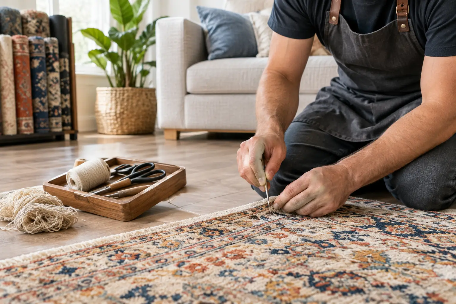
Use this Kennesaw rug repair guide to spot damage early, choose the right restoration, and protect the color, texture, and comfort of your favorite rug.

Marietta rug restoration can preserve color, texture, and history. Learn when repair makes sense and how thoughtful care protects a cherished rug at home.
From cozy area rugs to statement-making wall décor, our curated categories make it easy to explore what speaks to your space. Whether you’re refreshing a single corner or reimagining your whole home, start here and discover pieces that bring it all together.