Rug Restoration Versus Replacement Explained
Considering rug restoration versus replacement? Learn how damage, materials, sentiment, style, and room needs shape the right decision for your home today.
A room rarely feels finished because of furniture alone. More often, it comes together when the color story feels intentional – when the rug, lighting, pillows, and accents all speak the same language without matching too perfectly. That is why home decor color trends matter so much right now. The best ones are not about chasing a moment. They are about creating spaces that feel current, comfortable, and deeply personal.
What we are seeing in well-styled homes is a move away from sharp contrast and overly themed palettes. Instead, color is becoming more layered, a little softer, and much more livable. Homeowners still want freshness, but they also want rooms that will feel beautiful a few years from now, not just for one season.
One of the clearest shifts in home decor color trends is the return of softness. Stark whites and cool grays are giving way to warmer neutrals that carry more depth. Think creamy ivory, sand, oatmeal, camel, mushroom, and greige with a warm undertone. These shades make a room feel polished without feeling flat.
This change is especially useful in homes where comfort matters as much as appearance. A warmer neutral foundation tends to work better with wood furniture, natural fibers, and layered textiles. It also allows statement pieces to feel more integrated. A patterned rug, a sculptural lamp, or a richly colored throw has more room to shine when the backdrop is gentle rather than harsh.
That does not mean crisp white has disappeared. It still has a place, particularly in spaces with strong natural light or architecture that benefits from a clean frame. But for many living rooms and bedrooms, a softer neutral creates the kind of quiet luxury people are trying to achieve.
Earthy color palettes are not new, but they are evolving. The current version feels less rustic and more tailored. Clay, terracotta, olive, moss, tobacco, rust, and muted ochre continue to show up, though often in smaller, more deliberate ways.
Instead of painting an entire room deep rust, homeowners are using these colors through rugs, pillows, artwork, and accent chairs. That approach keeps the space flexible. It also helps when you want warmth without committing to a bold wall color that may feel heavy over time.
Olive and moss are especially versatile because they behave almost like neutrals in the right room. They pair beautifully with walnut finishes, brushed metals, linen upholstery, and natural stone. Terracotta and clay bring in warmth that feels grounded rather than bright. In family spaces, these tones can be forgiving as well as stylish, which is always a smart combination.
While many palettes are warming up, there is still strong interest in deeper, moodier shades. Navy, slate blue, forest, eucalyptus, and smoky teal continue to hold their place because they bring richness without overwhelming a room.
These colors work particularly well when a space needs contrast but not starkness. A deep blue rug can anchor a seating area while still feeling classic. Green accents can make a room feel fresh and settled at the same time. In dining rooms, studies, and bedrooms, darker tones often create the sense of intimacy people want.
The trade-off is that saturated colors need balance. In a smaller room or one with limited natural light, too much depth can feel closed in. That is where texture matters. When darker shades are paired with lighter upholstery, soft metallic finishes, glass, or layered lighting, the room feels dimensional rather than heavy.
Bright color is still part of the conversation, but it is showing up in a quieter register. Instead of sharp primary tones, the accents that feel most usable now are dustier and more nuanced. Blush with beige undertones, muted saffron, soft plum, faded coral, and mineral blue all bring personality without taking over.
This is good news for anyone who wants color but does not want their home to feel trendy in a disposable way. Softer accent colors are easier to live with and easier to layer. A few pillows, a patterned rug, or a ceramic lamp in one of these shades can shift the mood of a room without requiring a full redesign.
These hues are also effective in transitional spaces where homeowners want a touch of freshness. A neutral sofa can look entirely different with the right supporting palette around it. Often, it is not about replacing major pieces. It is about adjusting the tones that surround them.
If wall color sets the backdrop, the rug often sets the mood. It can introduce the leading colors of a room, soften strong contrasts, or bridge pieces that do not obviously belong together. This is one reason rugs remain such an important part of current decorating decisions.
A rug with layered neutrals can make a room feel calm and complete even before the accessories are added. A vintage-inspired pattern in blue, rust, and ivory can pull together wood tones, upholstery, and metal finishes that might otherwise feel disconnected. For homeowners who like flexibility, a rug is often a smarter place to experiment with color than a sofa or painted built-in.
Scale matters here. A large rug with subtle movement can support a whole room without competing with everything in it. A smaller, busier rug may bring charm, but it can also fragment the space if the palette is already active. The right choice depends on how much color is happening elsewhere.
For households refining a room over time, starting with the rug can make every later decision easier. It gives you a palette to work from and helps accessories feel intentional instead of random.
The most successful rooms are rarely built around a single shade. They are layered. That might mean a warm ivory base, medium wood tones, an olive rug, caramel leather, and a few black accents for definition. Or it might mean pale greige walls, soft blue textiles, antique brass lighting, and touches of plum in the accessories.
Layering keeps a room from feeling one-note. It also makes the space more resilient if your taste evolves. When color is distributed across textiles, art, lighting, and décor, you can refresh the room without starting from scratch.
This is where in-person shopping still has real value. Color is deeply affected by texture, sheen, and light. A beige pillow in velvet reads differently than the same tone in linen. A blue rug with warm undertones can transform how nearby furniture looks. Seeing these pieces together makes it much easier to build a cohesive room with confidence.
Not every trend deserves equal commitment. If you want a room that feels current but lasting, anchor the space with colors that have range. Warm neutrals, soft greens, deep blues, and earthy terracottas all have staying power because they connect easily with natural materials and classic forms.
If you are tempted by a more directional shade, use it where it is easy to edit. Pillows, throws, accent décor, and smaller upholstered pieces let you enjoy a fresh color without locking the whole room into one moment. This is often the better route for homeowners who like to refresh seasonally or who are still defining their style.
It also helps to think about the home as a whole. Rooms do not need to match, but they should feel related. Repeating a few undertones from space to space creates a sense of flow. That could mean carrying warm neutrals throughout the house and letting each room have its own accent color, or using one recurring tone like olive or slate blue in different ways.
For homeowners in Canton and the surrounding North Georgia communities, this softer and more grounded direction makes particular sense. It suits the way people actually want to live – comfortably, beautifully, and with pieces that feel collected rather than rushed.
The color trends worth following are the ones that help your home feel more like yours. If a palette brings warmth, balance, and a little more ease to the way a room lives every day, that is not just a trend. That is a good design decision.
Considering rug restoration versus replacement? Learn how damage, materials, sentiment, style, and room needs shape the right decision for your home today.
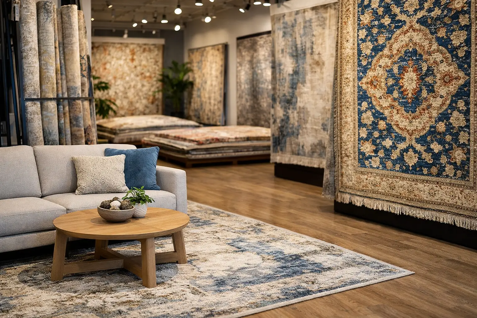
Find designer rugs Canton GA homeowners can see, feel, and style in person, with thoughtful guidance on size, materials, color, and lasting care at home.
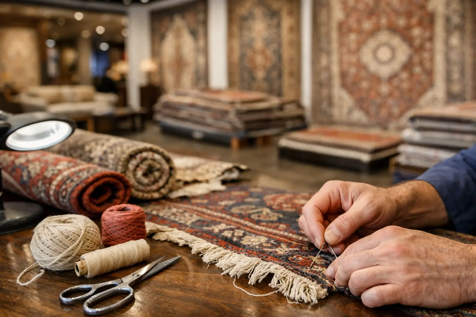
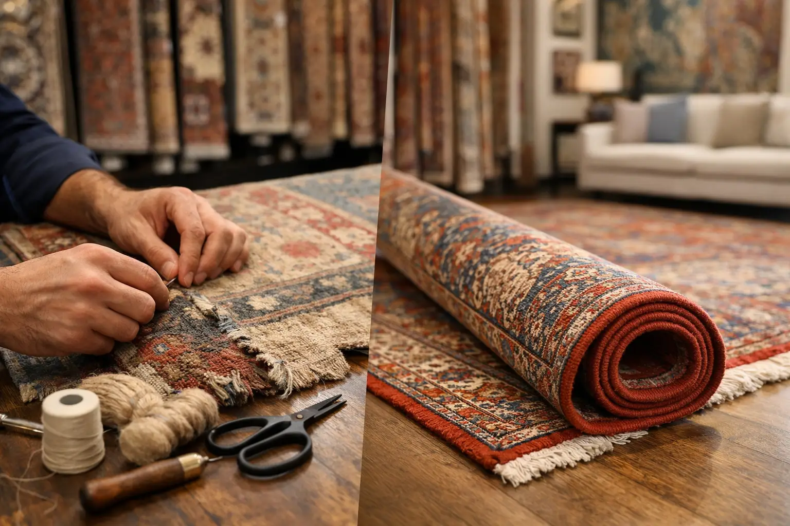
Rug repair Marietta GA homeowners can trust starts with careful assessment of fringe, edges, fibers, and color to preserve a rug’s original character.
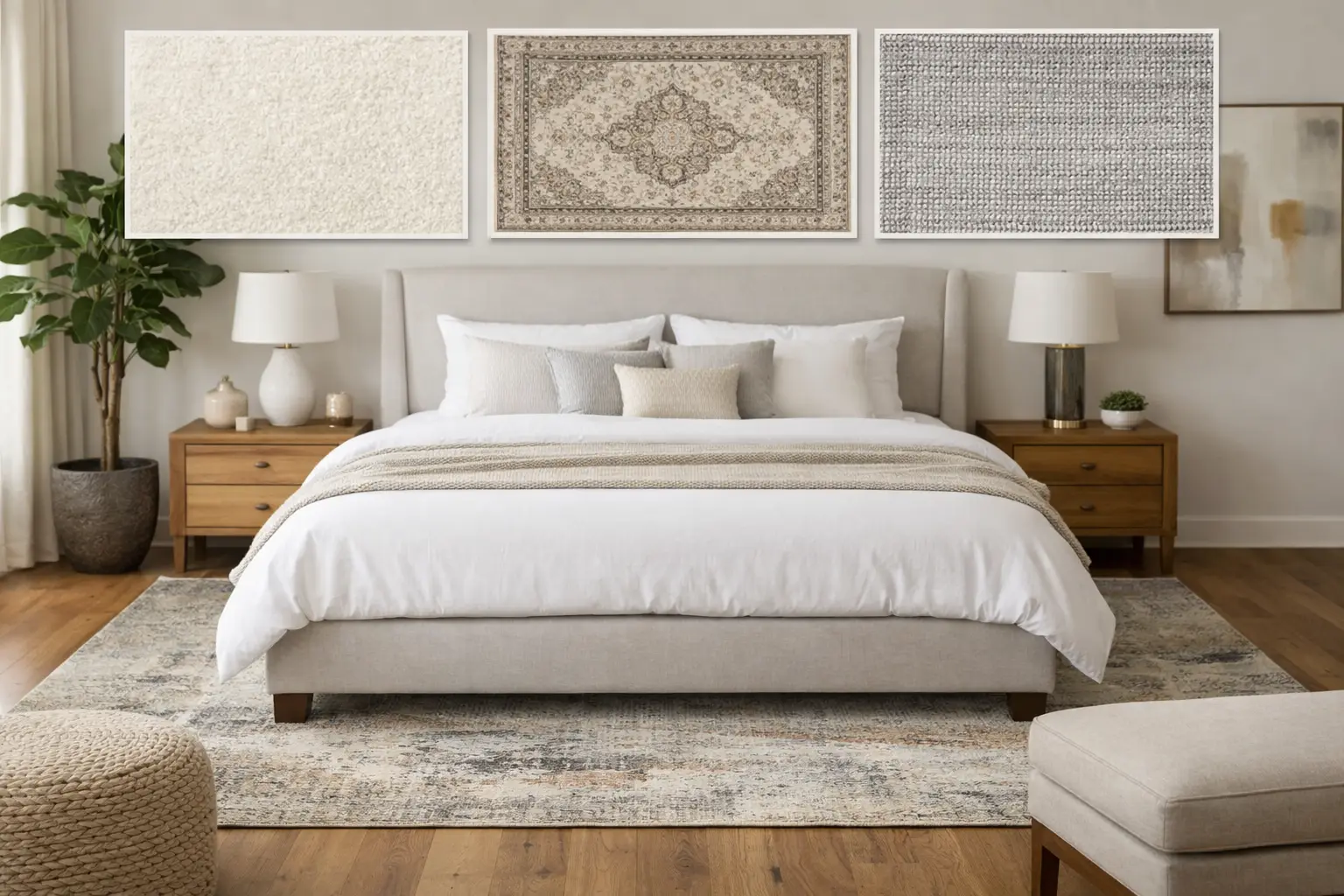
Wondering what size rug for king bed works best? Use these polished layouts and measurements to create a balanced, comfortable bedroom with confidence.
From cozy area rugs to statement-making wall décor, our curated categories make it easy to explore what speaks to your space. Whether you’re refreshing a single corner or reimagining your whole home, start here and discover pieces that bring it all together.