


How to Remove Pet Odors From Rugs Safely
Learn how to remove pet odors from rugs without harming color or fibers, plus when professional washing is the smarter choice for a fresh home that lasts.
A neutral rug can either make a room feel quietly finished or leave it looking slightly off, and the difference usually comes down to undertone. That is why neutral rug color matching is less about picking beige, gray, or ivory at a glance and more about seeing how that rug behaves next to your flooring, upholstery, wall color, and light.
If you have ever brought home a rug that looked warm in the showroom and oddly pink in your living room, or one that felt soft and elegant until it sat beside cooler flooring, you have already seen this in action. Neutral rugs are versatile, but they are not one-note. The right match creates ease. The wrong one can make an otherwise beautiful room feel unsettled.
Most homeowners think of neutrals as safe, and they usually are. But “safe” does not always mean effortless. A neutral rug still carries a temperature, depth, and visual weight. Ivory can lean creamy yellow or crisp off-white. Gray can read taupe, blue, or even green. Beige can feel sandy, caramel, mushroom, or blush depending on the fibers and surrounding finishes.
That is why a rug should not be chosen in isolation. A color that looks timeless under showroom lighting may shift dramatically once it is placed near medium-toned hardwoods, white oak, greige paint, or a linen sofa. In a well-styled room, the rug is not just filling floor space. It is connecting the room’s larger surfaces and softer details so everything feels intentional.
The most useful way to approach neutral rug color matching is to stop shopping by broad labels alone. “Beige,” “gray,” and “ivory” are starting points, not final answers. What matters most is the undertone.
Warm neutrals usually include hints of gold, camel, tan, rust, or cream. These tend to pair beautifully with traditional wood tones, warmer white paint, cognac leather, and rooms that want softness. Cool neutrals often carry notes of silver, stone, charcoal, blue-gray, or greige. These can work well with contemporary interiors, cooler paints, marble finishes, and cleaner contrast.
Then there are balanced neutrals, which often feel the easiest to live with because they sit somewhere in the middle. A taupe rug, for example, may bridge warm wood flooring and cooler upholstery better than a true gray or a strongly yellow beige.
If your room already feels cohesive, look for a rug that echoes those undertones. If your room feels split between warm and cool elements, look for a neutral that can gently connect both sides rather than favoring one too strongly.
Before choosing a rug, compare it against the three surfaces that visually dominate the room: flooring, the largest upholstered piece, and wall color. If the rug works with all three, it usually has a strong chance of working with the room as a whole.
Flooring is especially important because it takes up so much visual space. A creamy ivory rug on orange-toned wood can look rich and classic, while that same rug on cool gray flooring may feel disconnected. Likewise, a gray-beige rug may soften a room with strong contrast, but it can also fall flat if every finish is already muted and similar.
A neutral rug’s texture often changes its perceived color more than people expect. This is one reason online images can be misleading. Wool, jute blends, viscose accents, high-low piles, and hand-knotted variation all affect the way color reflects light.
A flatwoven rug in taupe might read cleaner and slightly cooler than a plush cut-pile version in the same hue. A heathered weave can help bridge multiple tones in the room, which makes it especially useful if your furniture and finishes are not perfectly matched. On the other hand, a solid neutral with a smooth finish creates a more tailored look, but it leaves less room for color flexibility.
Texture also affects formality. If you want a space to feel relaxed and layered, a neutral rug with visible variation usually works beautifully. If you are aiming for a more polished, quietly luxurious look, a refined pattern or low-contrast tonal design often delivers that finish without overwhelming the room.
Not every neutral belongs in every room, even when the palette seems close. The best choice depends on how you want the room to feel.
For living rooms, many homeowners want warmth without heaviness. This is where mushroom, oatmeal, soft taupe, and warm gray can be especially effective. They ground upholstered seating while still keeping the space open and welcoming.
In bedrooms, lighter neutrals often create the calmest result. Ivory, sand, and gentle greige can make the room feel airy and restorative, especially when paired with layered bedding and soft lighting. If the room already has a lot of pale finishes, adding subtle pattern helps keep the rug from disappearing completely.
Dining rooms ask for a slightly different approach. A neutral rug still needs to support the palette, but practicality matters. Mid-tone neutrals with some variation often hide everyday wear more gracefully than very pale solids. They also keep the room feeling finished rather than fragile.
Some rooms do better when the rug is not an exact color match. If your sofa, walls, and flooring all live in a similar range, a nearly identical rug can leave the space feeling flat. In that case, contrast within the neutral family creates definition.
That could mean choosing a deeper taupe rug under an ivory sectional, or a lighter oatmeal rug to lift darker furniture. The goal is not a dramatic statement. It is enough distinction to give the room shape.
This is especially useful in open-concept homes, where subtle contrast helps each seating area feel designed without breaking the overall flow.
When homeowners feel stuck, a patterned neutral rug is often the answer. A soft geometric, tonal floral, faded traditional motif, or organic abstract can pull together several shades at once. That gives you more freedom with nearby finishes and accessories.
Pattern is also helpful when your room includes mixed woods, layered textiles, or a combination of old and new furniture. Instead of forcing one exact neutral, the rug can act as the bridge that makes variety feel curated.
The key is scale. In a smaller room, a tight, low-contrast pattern keeps things calm. In a larger room, a broader pattern can anchor the seating area and keep the rug from feeling visually lost.
A rug you love at noon may look entirely different by evening. Natural daylight tends to reveal undertones clearly, while warm interior lighting can pull cream, gold, and beige forward. Cooler LED lighting can make some neutrals feel flatter or more gray than expected.
That is one reason in-person comparison matters so much with neutral rug color matching. Seeing the rug’s actual fibers, tonal shifts, and texture gives you a much better sense of how it will live in your home. For homeowners in Canton and nearby communities, visiting a showroom like Home Rug Gallery can make the decision far easier because subtle differences are much easier to spot when rugs are viewed side by side.
One of the biggest mistakes is matching only to paint and ignoring the floor. Another is choosing the lightest possible neutral because it feels universally elegant, even when the room needs more grounding. A third is assuming gray is always the safest option in updated interiors. In many homes, a soft taupe or greige is actually more flexible and more flattering.
It also helps to avoid chasing perfection. A rug does not need to match every finish exactly. In fact, rooms usually feel more natural and deeply personal when the tones relate rather than repeat.
A well-chosen neutral rug does something subtle but powerful. It quiets visual noise, softens transitions, and gives the room a sense of ease that feels effortless. When the undertones, texture, and contrast are working together, you may not immediately notice the rug itself. You simply notice that the room feels right.
That is the beauty of thoughtful neutral rug color matching. It is not about playing it safe. It is about choosing a foundation that lets everything else in the room feel more considered, more comfortable, and more like home.
Learn how to remove pet odors from rugs without harming color or fibers, plus when professional washing is the smarter choice for a fresh home that lasts.
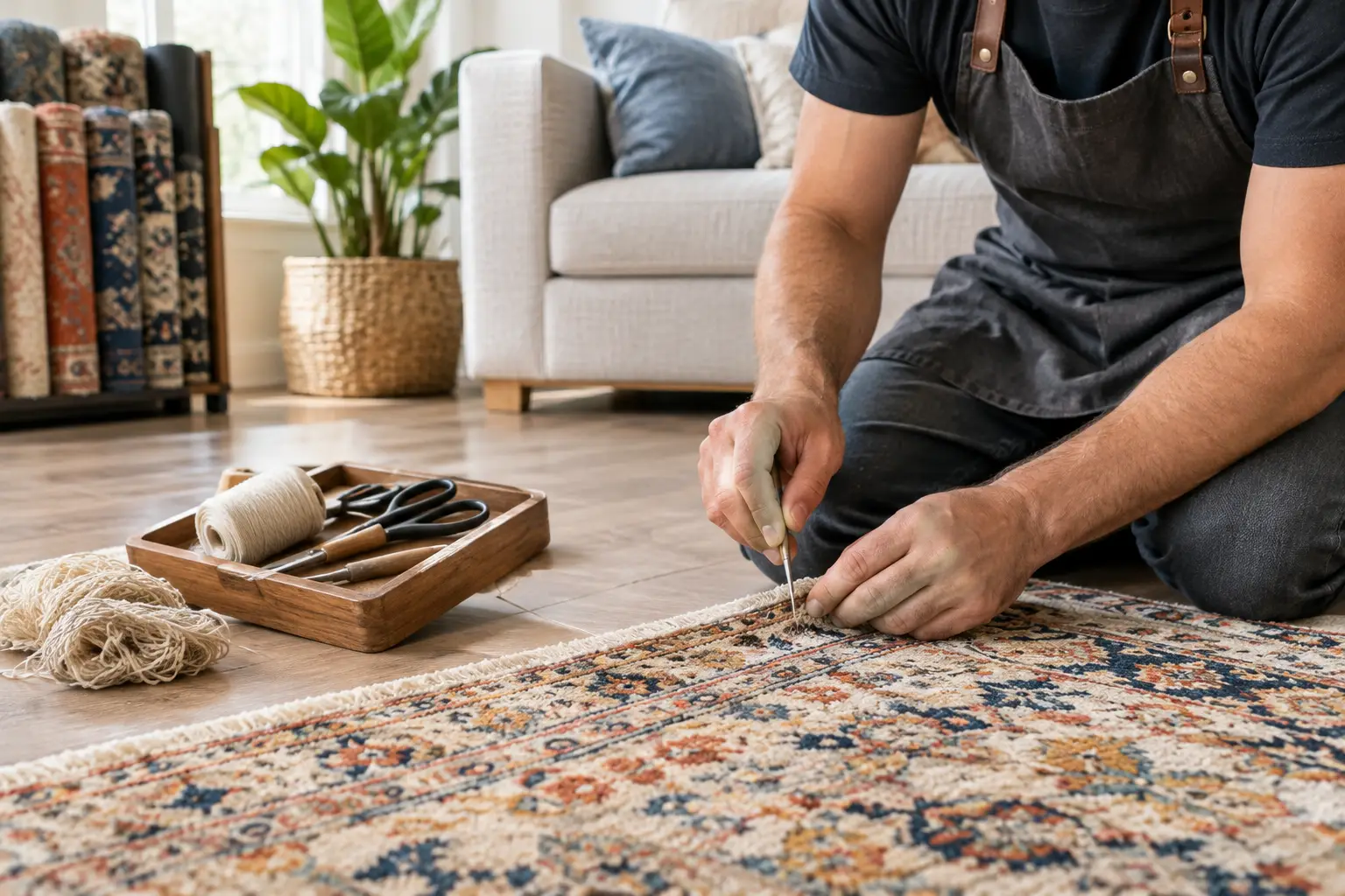
Use this Kennesaw rug repair guide to spot damage early, choose the right restoration, and protect the color, texture, and comfort of your favorite rug.
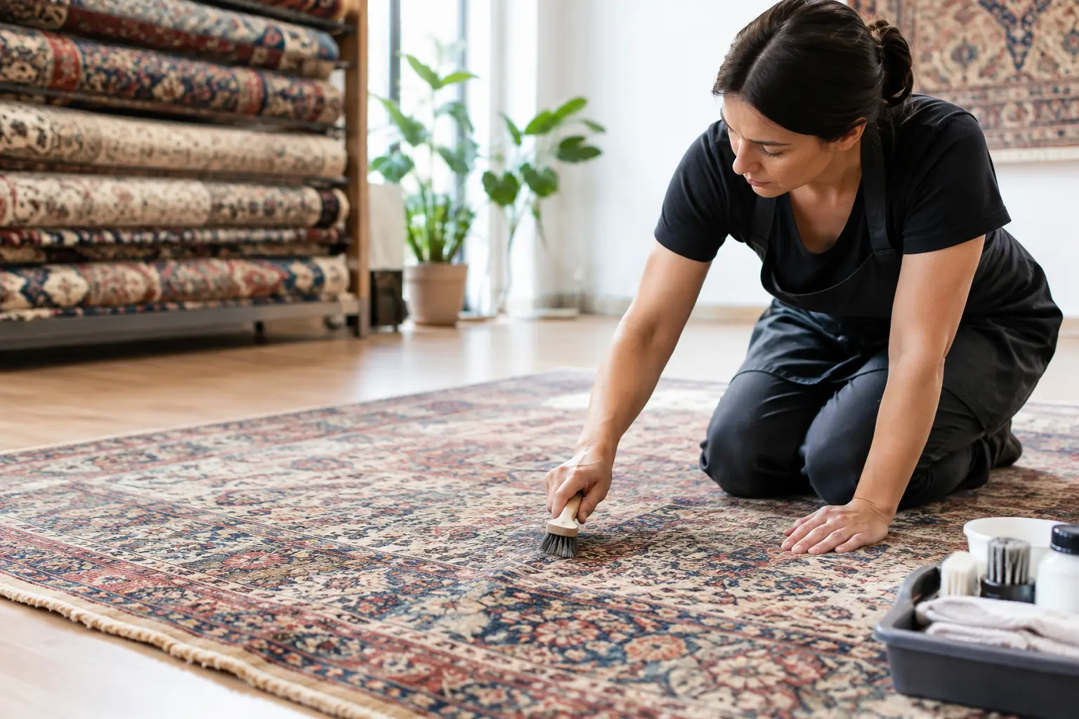
Marietta rug restoration can preserve color, texture, and history. Learn when repair makes sense and how thoughtful care protects a cherished rug at home.
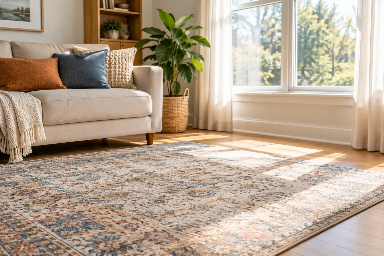
Learn how to protect rugs from sun fading with thoughtful window treatments, rotation, cleaning, and placement tips that preserve color and comfort daily.
From cozy area rugs to statement-making wall décor, our curated categories make it easy to explore what speaks to your space. Whether you’re refreshing a single corner or reimagining your whole home, start here and discover pieces that bring it all together.