

How to Remove Pet Odors From Rugs Safely
Learn how to remove pet odors from rugs without harming color or fibers, plus when professional washing is the smarter choice for a fresh home that lasts.
A rug can shift the mood of a room faster than a new paint color, especially when the shade underfoot changes how everything else reads. That is exactly why rug color trends 2026 matter for homeowners who want a space to feel current without chasing something fleeting. The strongest colors this year are not loud for the sake of being noticed. They are layered, grounded, and chosen to make a room feel more settled, more personal, and more beautifully finished.
What stands out most for 2026 is a move away from flat, one-note palettes. Homeowners are leaning into color that feels collected rather than stark, with tones that bring warmth and depth even in clean, modern spaces. If your room has been feeling a little too beige, too gray, or simply unfinished, the right rug color can do more than decorate. It can anchor the entire design.
The biggest shift is not just which colors are in. It is how they are being used. Instead of high-contrast palettes that make a rug the only focal point, 2026 favors colors that work with wood tones, upholstery, lighting, and layered textiles. The effect feels more refined and more relaxed.
That means warm neutrals are replacing cool grays in many homes, earthy greens are stepping in as a quiet statement, and blues are becoming richer and moodier. Even when a rug includes pattern, the palette tends to feel edited and intentional rather than overly busy. This is good news if you want something stylish that still has staying power.
Of course, trend should never outweigh the way you live. A color that looks beautiful in a showroom still needs to make sense with pets, children, natural light, and the rest of your furnishings. The best 2026 rug colors succeed because they feel elegant while still being practical.
Cream, sand, mushroom, oat, camel, and soft taupe continue to lead, but they are warmer now. These are not the icy neutrals that dominated for years. They have a sun-washed softness that brings comfort into the room and pairs beautifully with natural wood, linen, boucle, and brushed metal finishes.
A warm neutral rug works especially well if you want the room to feel effortlessly styled without drawing attention to one single piece. It is often the right choice for open-concept living spaces, primary bedrooms, and homes where the goal is quiet luxury rather than contrast. The trade-off is that very pale rugs can show daily life more quickly, so tone and texture matter. A slightly heathered neutral often wears more gracefully than a solid ivory field.
Green has been building for a while, but in 2026 it looks more grounded and architectural. Think olive rather than mint, moss rather than bright botanical, and muted sage instead of pastel. These shades bring an organic calm that works surprisingly well as a neutral.
Green rugs are especially effective in rooms that need softness but not sweetness. They pair well with leather seating, walnut tables, matte black accents, and creamy upholstery. In homes with a view of trees or layered landscaping outside, these tones can help connect the indoors to the natural setting. If your room already has a lot of green in art, drapery, or pillows, the better choice may be a rug with green woven into a pattern instead of a full green field.
Blue remains a favorite, but the direction has shifted. The blues leading rug color trends 2026 are deeper and more nuanced – slate blue, mineral blue, stormy denim, and blue with a whisper of green. They feel classic, but not predictable.
This palette works beautifully when a room needs definition. In a living room with lighter furniture, a deeper blue rug can create just enough contrast to make the space feel finished. It is also a smart option for busy family areas because variation in tone tends to be more forgiving day to day. If the room already feels cool, balance these blues with warm wood, brass, or camel leather so the overall look stays inviting.
Warmer earth tones are becoming more refined. The 2026 version is less desert-theme and more tailored warmth. Rust, clay, cinnamon, and softened terracotta add character without overpowering a room, especially when they appear in faded, antique-inspired patterns or low-contrast designs.
These tones are ideal for homeowners who want color but do not want their space to feel trendy in a short-lived way. They add warmth to white walls, complement traditional architecture, and bring life to rooms that feel too cool or overly neutral. In brighter spaces, these shades feel collected and welcoming. In darker rooms, they can read even richer, so it helps to compare samples in the actual lighting before making a final choice.
One of the more interesting developments this year is the return of moody accent color. Deep plum, aubergine, and brown-infused burgundy are appearing in sophisticated patterns and layered palettes. These shades are not for every room, but when used well, they create depth that feels memorable and distinctly personal.
They tend to work best in studies, dining rooms, and formal living spaces where you want more atmosphere. In a casual family room, they can still be beautiful, but they usually need softer companion tones around them so the room does not feel heavy. Think of these colors as a design move rather than a default choice.
One reason these shades feel so wearable is that many 2026 rugs do not present color in a flat, uniform way. Instead, they are washed, abrash, tonal, or layered through subtle pattern. That gives the rug movement and helps it relate to more pieces in the room.
For homeowners who love color but worry about commitment, this is often the most comfortable path. A rug that blends blue, taupe, and soft olive can bridge multiple finishes at once. It also gives you more flexibility if you change accent pillows, art, or lighting later.
Pattern scale matters too. A large-scale design can make a bold color feel less busy because the room reads the palette before the detail. A tightly patterned rug may disguise wear beautifully, but in a smaller room it can feel visually dense. It depends on how much furniture sits on top and how calm or layered you want the space to feel.
The best way to approach rug color trends 2026 is to start with the room you actually have, not the one you saw in a perfectly lit photo. Natural light, flooring, wall color, and upholstery all affect how a rug reads.
If your home has a lot of warm wood and creamy paint, lean into warm neutrals, olive, clay, or softened blue. If your finishes are cooler, a stone-toned rug with subtle warmth can help rebalance the space without forcing a full redesign. In homes with children or pets, medium-value colors and tonal pattern often offer the best blend of style and everyday livability.
It also helps to decide what role the rug should play. Sometimes the room needs a quiet foundation. Sometimes it needs the rug to carry the color because the furniture is intentionally restrained. Neither approach is better. The right choice depends on whether you want the room to exhale or speak up.
For many homeowners, seeing color in person makes all the difference. A rug that looks beige online may read pink, yellow, or gray once it is next to your sofa and flooring. Texture also changes color perception. A cut pile, hand-knotted finish, or natural fiber blend can soften or intensify the same shade in very different ways.
The most successful rug trends are the ones that fit into real homes for years, not months. That is why 2026 feels so appealing. Even the more directional colors are rooted in nature and softened by texture, which makes them easier to live with.
If you are hesitant about choosing a stronger color, start with a classic palette interpreted in a fresher way. A blue rug with mineral undertones, a neutral rug with warmer depth, or a traditional pattern with hints of olive can all bring the room forward without making it feel overdone. In a showroom setting, these nuances are often much easier to compare side by side, especially when you are trying to coordinate with pillows, lighting, and surrounding décor.
The right rug color should feel like it belongs in your home from the moment it is placed, even if it introduces something new. That is the beauty of where 2026 is heading. The palette is elevated, but still approachable. Designed, but still comfortable. Trend-aware, but deeply personal.
If your room is asking for a refresh, start underfoot. The color that feels right may be the one that makes everything else fall into place.
Learn how to remove pet odors from rugs without harming color or fibers, plus when professional washing is the smarter choice for a fresh home that lasts.
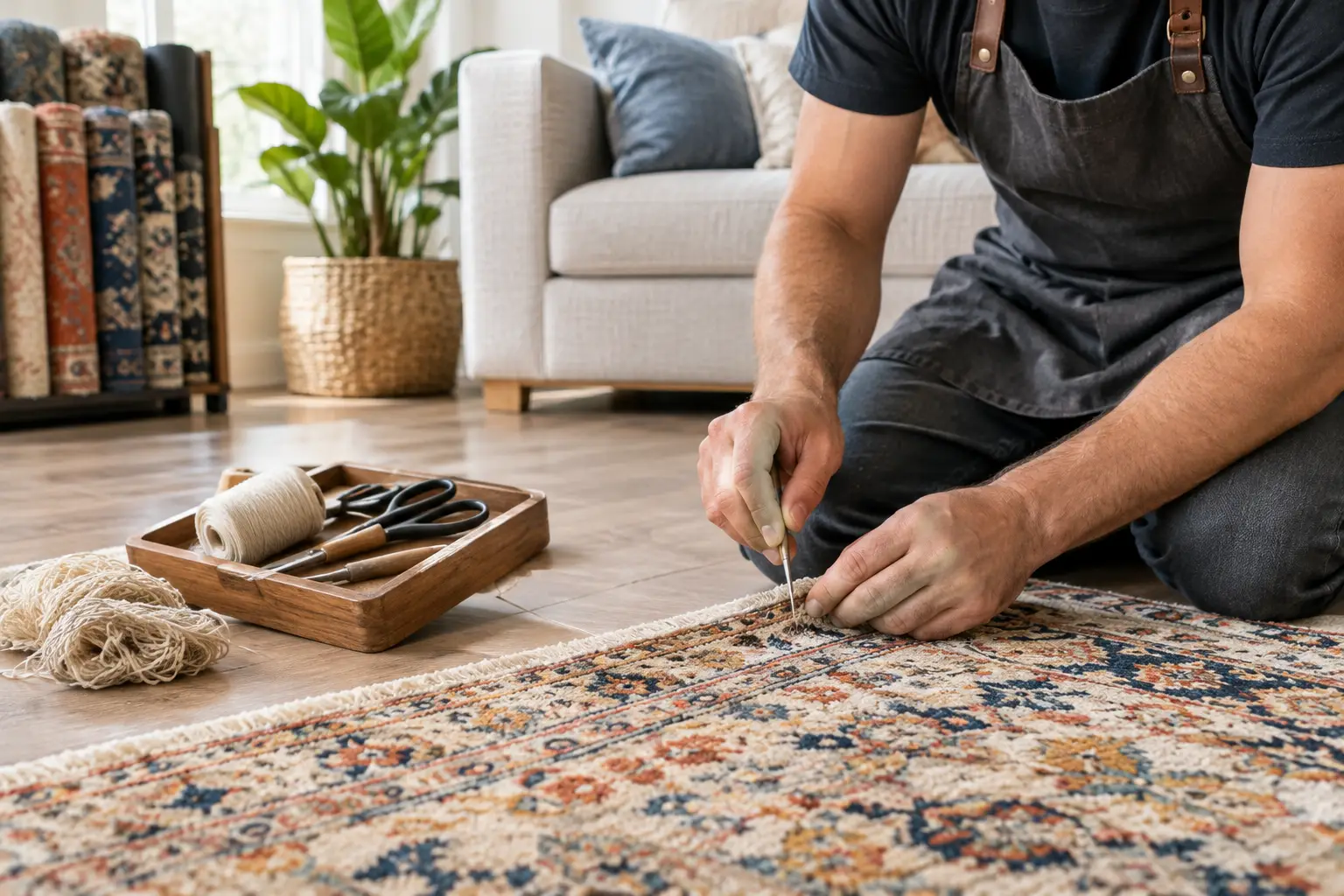
Use this Kennesaw rug repair guide to spot damage early, choose the right restoration, and protect the color, texture, and comfort of your favorite rug.
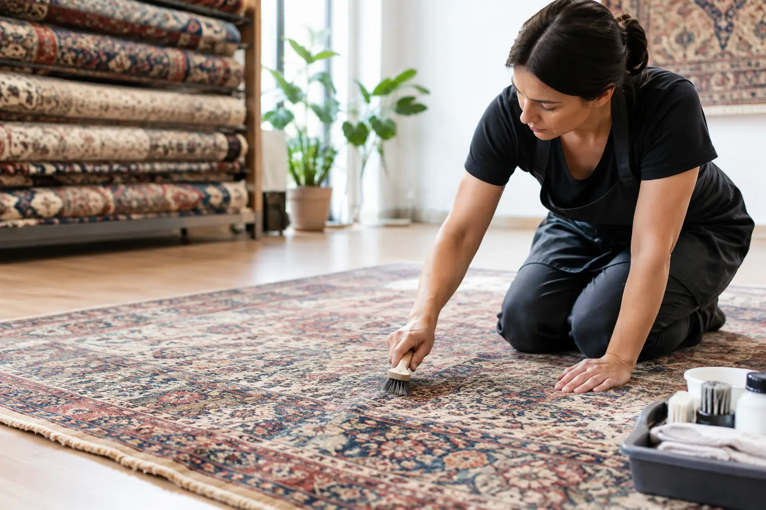
Marietta rug restoration can preserve color, texture, and history. Learn when repair makes sense and how thoughtful care protects a cherished rug at home.
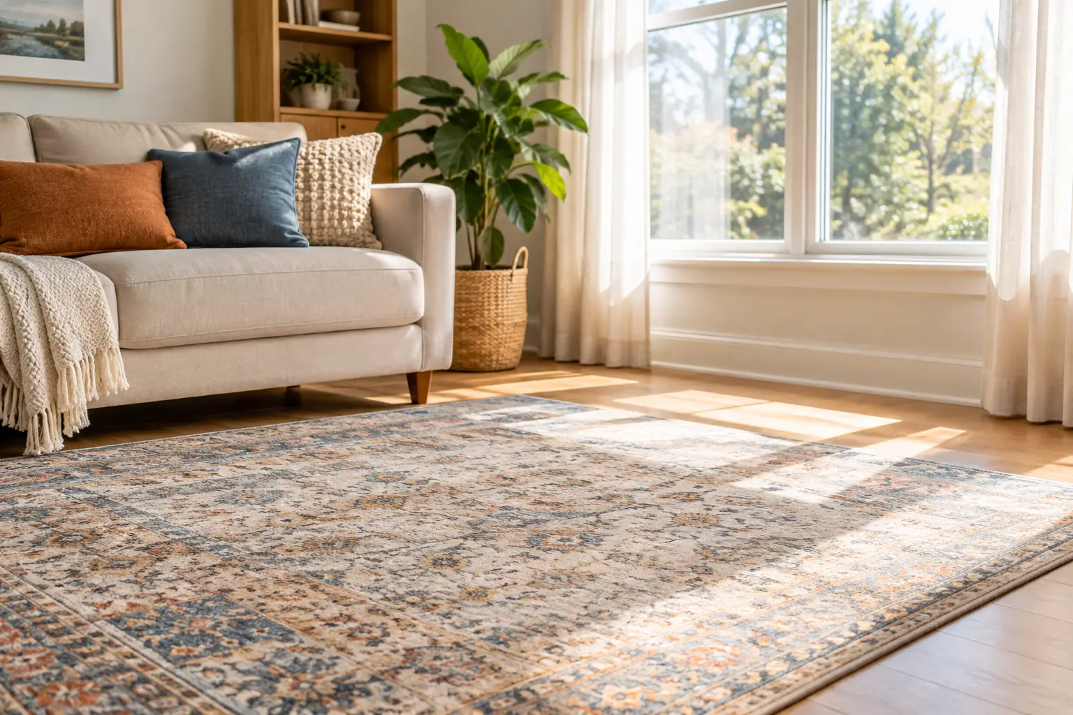
Learn how to protect rugs from sun fading with thoughtful window treatments, rotation, cleaning, and placement tips that preserve color and comfort daily.
From cozy area rugs to statement-making wall décor, our curated categories make it easy to explore what speaks to your space. Whether you’re refreshing a single corner or reimagining your whole home, start here and discover pieces that bring it all together.