


How to Remove Pet Odors From Rugs Safely
Learn how to remove pet odors from rugs without harming color or fibers, plus when professional washing is the smarter choice for a fresh home that lasts.
A pendant can make a kitchen island feel tailored, turn a breakfast nook into a destination, or bring the right sense of scale to an entry. It can also look strangely small, hang too high to be useful, or compete with every other finish in the room. Knowing how to pick pendant lighting comes down to more than choosing a beautiful shade. You are choosing a focal point that has to work with the room’s proportions, daily routines, and overall point of view.
Pendant lighting is one of the most visible finishing layers in a home. Like an area rug, it helps define a zone and set the visual rhythm of the room. The right choice feels effortless because it relates naturally to the furniture, ceiling height, colors, textures, and surrounding décor.
Before looking at finishes or silhouettes, decide what the fixture needs to accomplish. A pendant over an island often provides task lighting for meal prep, homework, and gathering. Over a dining table, it creates a more intimate pool of light and gives the table a finished presence. In a foyer, it is primarily a welcoming statement, although it still needs to light the path clearly.
This distinction affects the design. Clear or open shades allow more direct light and are useful where visibility matters. Fabric, opal glass, or shaded fixtures produce a softer glow and can feel more relaxed in a dining room or bedroom. A dramatic sculptural pendant can be exactly right in an entry, but it may not provide enough light on its own for a busy kitchen.
Also consider whether the pendant will be the room’s main light source or part of a layered plan. Kitchens usually need ceiling lighting, under-cabinet lighting, and decorative pendants working together. If a pendant is meant to provide atmosphere rather than strong illumination, you have more freedom to choose a moodier material or more enclosed shade.
Scale is where a lovely fixture either becomes a confident design choice or disappears into the room. Start by looking at the surface below it. A narrow pendant above a substantial island can feel lost. An oversized fixture above a compact round table can crowd the space, even if the ceiling is tall.
For a single pendant over a dining table, aim for a fixture that is roughly one-half to two-thirds the width of the table. Leave visual breathing room around the edges. Over an island, two or three smaller pendants often create better balance than one large fixture, especially when the island is long and narrow. The fixtures should relate to the island without forming a solid visual wall.
Spacing matters just as much as diameter. When using multiple pendants, allow approximately 24 to 30 inches between the edges of the fixtures. Keep the outer pendants comfortably inset from each end of the island rather than lining them up with the corners. This creates a calmer, more intentional composition.
Ceiling height can influence the size you choose, but it does not automatically require a bigger fixture. A room with high ceilings may benefit from a taller form, a clustered arrangement, or a pendant with more visual presence. In a standard-height room, a broad but shallow fixture can make a statement without dropping too low into the sightline.
The most beautiful pendant still has to live well with people. Over a kitchen island or dining table, the bottom of the fixture typically hangs 30 to 36 inches above the surface. This range gives enough clearance for conversation while keeping the light close enough to feel purposeful. If your ceilings are higher than eight feet, you can raise the fixture slightly, but do so gradually. A pendant that sits too high often feels disconnected from the table or island it is meant to anchor.
Over a kitchen sink, a pendant should clear faucets, cabinet doors, and the view through nearby windows. In an open entry or hallway, preserve adequate headroom. The fixture should feel elevated, not like an obstacle guests have to navigate around.
Do not rely on measurements alone. Before final installation, have someone hold the fixture or a paper template at the proposed height. Stand at the counter, sit at the table, and look into the room from the adjoining spaces. This simple step reveals whether the fixture interrupts a view, blocks artwork, or needs a small adjustment.
Pendant lighting adds another material to the room, so it should complement the story already taking shape. A matte black pendant can give a pale, layered kitchen a tailored edge. Aged brass brings warmth to rooms with creamy textiles, warm wood, and traditional details. Natural woven shades add softness and texture, especially in casual dining spaces and sunlit breakfast nooks.
Glass deserves particular attention. Clear glass feels airy and lets the bulb become part of the design, which works well with vintage-inspired or modern organic interiors. Seeded or ribbed glass adds texture and gently disguises the bulb. Opal glass has a quieter, timeless quality and diffuses light beautifully, making it a strong choice when you want the fixture to feel polished without commanding every bit of attention.
You do not need to match every metal finish in the room. In fact, a thoughtful mix often looks more collected. The key is repetition and balance. If the pendant is brass, a small brass note elsewhere, such as a cabinet pull, picture frame, or accent table detail, helps it feel connected. If your hardware is chrome but the pendant is black, repeat black through stools, a rug pattern, or a nearby decorative accent.
Pendant lighting should not be selected in isolation. Look down as well as up. An area rug, dining chairs, countertop material, and window treatments all influence what will feel at home overhead.
A rug with an intricate traditional pattern can support a simple globe or linen-shaded pendant that lets the textile remain the visual centerpiece. In a room with a quiet, neutral rug and streamlined furniture, a sculptural pendant may provide the dimension the space is missing. If your rug has warm terracotta, moss, or muted blue tones, consider whether the fixture’s metal, glass, or shade can echo that warmth without trying to match it exactly.
This is especially valuable in open-concept homes, where an island pendant may be visible from the living room and dining area at once. The fixture does not have to match every chandelier or lamp, but it should share a design language. Repeated curves, a related metal tone, or a similar level of formality can tie the spaces together.
A pendant’s shade can change the quality of light, but the bulb determines much of its daily character. Warm white light is generally the most inviting choice for living areas, dining spaces, and bedrooms. In task-focused kitchens, slightly brighter light can be useful, provided it does not look stark against warm cabinetry and natural materials.
Dimmable lighting offers the most flexibility. Brighten the pendants for cooking or setting out a buffet, then lower them for dinner or a quiet evening at home. If the bulb will be visible, choose one with a pleasing shape and a gentle glow. Exposed bulbs can be beautiful, but overly bright ones create glare, particularly when seated beneath a clear-glass fixture.
Pay attention to shadows, too. A solid metal shade directs light downward and may leave the ceiling and surrounding room darker. That can be a wonderful focused effect over an island, but it works best when other light sources fill in the rest of the space.
The most frequent mistake is choosing a fixture because it looks right in a photograph without considering its dimensions. Product images rarely communicate scale well. A pendant that seems delicate online may be much larger in person, while a fixture that feels substantial in a close-up may disappear in a large kitchen.
Another misstep is treating pendants as the only decorative lighting in the room. When everything overhead competes for attention, the space can feel busy. Let one element take the lead. A striking island pendant may call for quieter sconces, simple recessed lighting, and restrained accessories nearby.
Finally, do not overlook comfort. A fixture with a low, wide shade may be visually appealing but frustrating if it blocks sightlines across the island. A highly textured natural-fiber pendant can be gorgeous, yet it may not suit an area exposed to cooking residue or frequent splashes. The best choice honors both the room’s style and the way your household actually uses it.
Seeing pendant lighting alongside rugs, pillows, and other layers of a room can make the decision far clearer than viewing one piece at a time. At Home Rug Gallery, homeowners can compare materials and finishes in person, then choose a fixture that feels not merely coordinated, but deeply personal. Let the pendant earn its place in the room: beautiful from the doorway, comfortable at the table, and right for the life happening beneath it.
Learn how to remove pet odors from rugs without harming color or fibers, plus when professional washing is the smarter choice for a fresh home that lasts.

Use this Kennesaw rug repair guide to spot damage early, choose the right restoration, and protect the color, texture, and comfort of your favorite rug.

Marietta rug restoration can preserve color, texture, and history. Learn when repair makes sense and how thoughtful care protects a cherished rug at home.
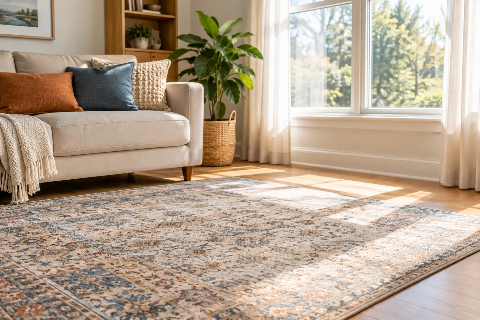
Learn how to protect rugs from sun fading with thoughtful window treatments, rotation, cleaning, and placement tips that preserve color and comfort daily.
From cozy area rugs to statement-making wall décor, our curated categories make it easy to explore what speaks to your space. Whether you’re refreshing a single corner or reimagining your whole home, start here and discover pieces that bring it all together.